SVG Filter Heatmaps
2024

SVGs (and especially their filters) are really, really cool. I also tend to get injured doing Brazilian jiu-jitsu, a lot.
So I figured why not combine these two for a cool little code experiment.
The magic of <feComponentTransfer>
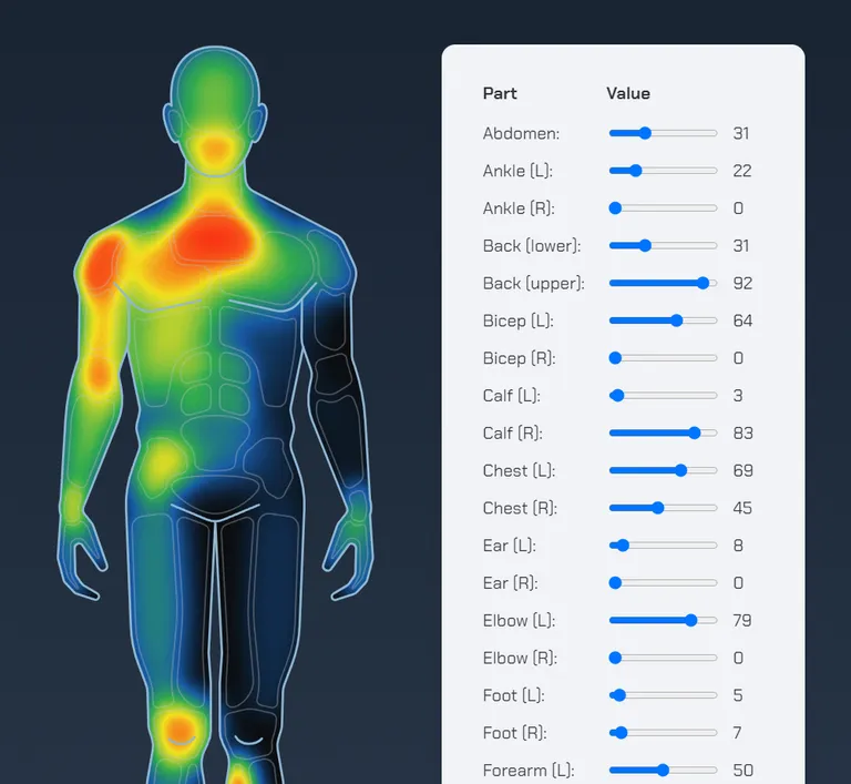
When I learned about the <feComponentTransfer> filter and how it basically applies a gradient map to an image, the idea popped into my head to try a “heatmap” effect to see where my most common (and most severe) injuries were located. Best case, I learn what to strengthen up to prevent more injuries; worst case, I know what to watch out for in the future. 😅
The <feComponentTransfer> filter works like this:
<svg>
    <!-- 1. Define your filter -->
    <filter id="heatmap">
        <!-- 2. Add the feComponentTransfer effect -->
        <feComponentTransfer>
            <!-- Add a function for each channel (red, green, blue, alpha) -->
            <feFuncR type="table" tableValues="0 1" />
            <feFuncG type="table" tableValues="0 1" />
            <feFuncB type="table" tableValues="0 1" />
            <feFuncA type="table" tableValues="0 1" />
        </feComponentTransfer>
    </filter>
</svg>
On each transfer function element (e.g. <feFuncR>) we set the type="table" attribute to tell the filter to do a linear interpolation between the values in the tableValues attribute. In practice, this basically means that the darkest areas of the image will have their red channel turned up or down according to that first value, and the lightest areas will do the same according to the last value.
Any values in between them also get interpolated (with 0 being the min and 1 being the max).
So for example, <feFuncR type="table" tableValues="0 1 0"></feFuncR> means “for black areas of the image, have no red color whatsoever, for halfway-bright areas of the image have maximum red, and for white areas of the image have no red again.”
To show it in action, we’ll start with a simple black and white gradient and apply it to a rectangle in the SVG:
<linearGradient id="gradient">
    <stop stop-color="black" offset="0%" />
    <stop stop-color="white" offset="100%" />
</linearGradient>
<rect width="200" height="10" fill="url(#gradient)" />
Result:
Then we’ll add a filter to the rectangle which basically says “the black end of the spectrum should only be blue, and the white end of the spectrum should only be yellow (i.e. max red and green values):”
<!-- 1. Define your filter -->
<filter id="basic-filter" color-interpolation-filters="sRGB">
    <feComponentTransfer>
        <!-- 2. Have 0% red at black and 100% red at white -->
        <feFuncR type="table" tableValues="0 1" />
        <!-- 3. Have 0% green at black and 100% green at white -->
        <feFuncG type="table" tableValues="0 1" />
        <!-- 4. Have 100% blue at black and 0% blue at white -->
        <feFuncB type="table" tableValues="1 0" />
    </feComponentTransfer>
</filter>
<!-- 5. Apply the filter to the gradient rectangle -->
<rect x="0" y="0" width="200" height="10"
    fill="url(#gradient)"
    filter="url(#basic-filter)"
/>
New result:
You can apply that filter to an image too, which is extra neat:


Adding multiple color stops
Now comes the fun part: you can add as many stops as you like in between the starting and ending tableValues values for each channel, and crank those values up and down anyway you like.
Here’s a fun playground — add/remove colors below and click the color picker to customize each one, then notice how the values in the code update:
feFuncR | feFuncG | feFuncB | ||
|---|---|---|---|---|
<feFuncR type="table" tableValues="0.17 0.09 0.19 0.95 0.99" />
<feFuncG type="table" tableValues="0.24 0.35 0.67 0.88 0.03" />
<feFuncB type="table" tableValues="0.36 0.65 0.31 0.13 0.08" />

Creating the heatmap transition effect
In the final demo, you might’ve noticed that the heatmap colors don’t simply fade from one to the other when the values change. Instead, they gradually “move” through the gradient as the values go up and down.
The trick to pulling this off is to have a path be filled with pure white, set its opacity according to how “warm” or “cold” it should be in the heatmap, apply a blur to that white element (as much or as little as you like), group it with another path filled with a pure black background, and apply the heatmap filter to the entire group.
That was a bit of a mouthful, but the code is actually way simpler:
<svg viewBox="0 0 100 100">
    <!-- 1. Apply the mask to the group -->
    <g style="filter: url(#heatmap);">
        <!-- 2. Set the black background -->
        <rect fill="black" x="0" y="0" width="100" height="100" />
        <!-- 3. Set the white foreground with some opacity -->
        <circle
            fill="white" cx="50" cy="50" r="20"
            style="filter: blur(8px); opacity: 0.75;"
        />
    </g>
</svg>
The result (with and without the filter applied):
Opacity:70%
Building the final heatmap SVG
The rest is nothing too fancy: just meticulously drawing the outlines of the person as an SVG path, along with the outlines for each body part in the heatmap. Each part is then given its own blur depending on how big it is (for example, the pecs cover a larger area than the wrist, so they get a bigger blur applied).
Now with all those effects combined, and a slider to control each body part’s opacity in the heatmap filter, the final injury heatmap mini-app is done and working!